More than 60% of all searches now happen on a phone, and Google ranks your site based on the mobile version of your pages, not the desktop one. If your site looks great on a laptop but breaks on a mobile screen, you are losing rankings and visitors every single day. Our free Mobile SEO Checker scans your page and tells you exactly what is holding your mobile performance back.
I work as an SEO professional, and I run this exact tool on every client site and on my own properties before I publish content. I built this guide from real testing, not theory, so you get answers that actually match what you see in the tool.
What Is a Mobile SEO Checker?
A mobile SEO checker is a tool that scans your webpage’s HTML and code to find out whether it meets Google’s mobile-first indexing standards. It looks at your viewport settings, font sizes, tap target sizes, and responsive design rules, then gives you a score out of 100 along with a list of fixes.
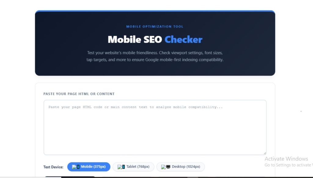
You do not need to install anything or connect your site through a complicated dashboard. You paste your page’s HTML or content into the tool, pick a test device, and get instant results.
Why Mobile SEO Matters in 2026
Google switched to mobile-first indexing years ago, and the rollout finished in 2023. This means Google’s crawler looks at your mobile page first when it decides how to rank you, even for people searching on desktop.
Here is why this affects your traffic directly:
- Over 60% of global search traffic comes from mobile devices, so most of your visitors never see your desktop layout at all.
- Google uses your mobile page to determine rankings across both mobile and desktop search results.
- A poor mobile experience increases your bounce rate, which signals to Google that your page does not satisfy the searcher.
- Core Web Vitals, a confirmed ranking factor, weigh mobile speed and stability heavily.
- Slow or broken mobile pages reduce conversions, even if your content ranks well.
If your competitors fix their mobile issues and you don’t, you fall behind in rankings even when your content is better written.
How to Use the Mobile SEO Checker
You can run a full mobile audit in under a minute. Follow these steps:
- Copy the HTML or content of the page you want to test.
- Paste it into the input box on the Mobile SEO Checker tool.
- Choose your test device: mobile (375px), tablet (768px), or desktop (1024px).
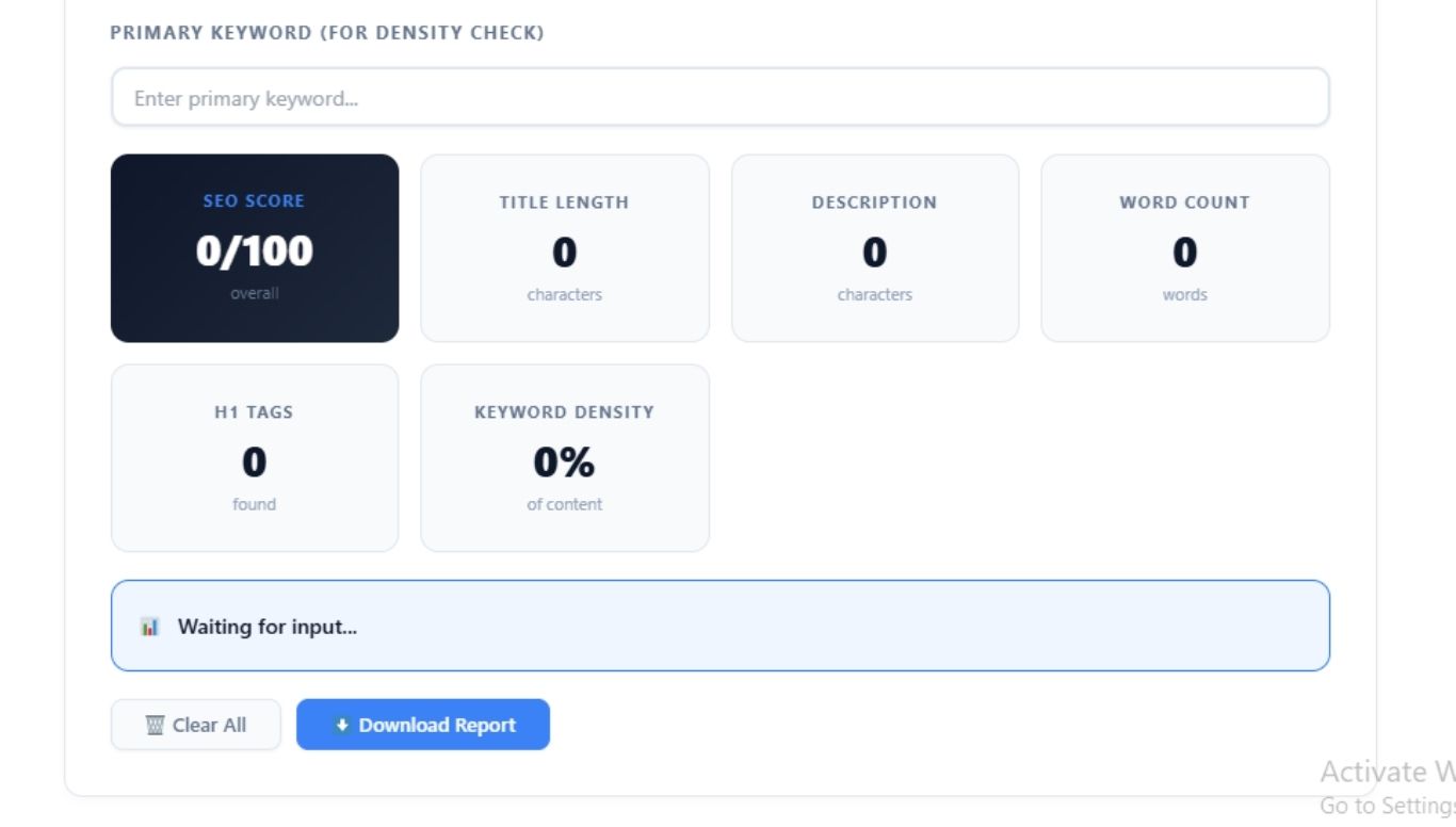
- Review your mobile score, along with individual checks for viewport tag, font size, tap targets, and responsiveness.
- Read the “What’s Good” and “Issues Found” sections to see your exact next steps.
- Download the report if you need to share it with a developer or client.
This workflow works whether you manage one website or audit pages for multiple clients, since you can run it as many times as you need without signing up.
What the Tool Checks
| Check | What It Verifies | Google’s Standard |
|---|---|---|
| Viewport Meta Tag | Detects proper viewport configuration | width=device-width, initial-scale=1 |
| Font Size | Confirms readable text without zooming | Minimum 16px for body text |
| Tap Target Size | Checks spacing of buttons and links | At least 44×44 pixels |
| Responsive Design | Test CSS media queries | The layout adapts to screen size |
| Content Width | Confirms no horizontal scrolling | Fits within device width |
| Mobile Usability | Combines all factors into one score | Overall pass or fail rate |
Understanding Your Mobile Score
Your score tells you how close your page is to Google’s mobile-first standards. Here is what each range means in practice.
| Score Range | Status | What It Means |
|---|---|---|
| 80-100 | Excellent | Your page is fully optimized for mobile-first indexing |
| 60-79 | Good | Mostly mobile-friendly, with small improvements left |
| 40-59 | Fair | Multiple usability issues are likely hurting your rankings |
| Below 40 | Poor | Major problems that need fixing before you publish more content |
If you score below 60, prioritize fixing the viewport tag and font size first, since these affect every visitor immediately.
Common Mobile SEO Issues and How to Fix Them
These are the problems I see most often when auditing client sites:
Missing viewport meta tag. Add this single line inside your HTML head: <meta name=”viewport” content=”width=device-width, initial-scale=1″>. Without it, mobile browsers render your page as if it were on a desktop and shrink everything to fit.
Text smaller than 16px. Small text forces users to pinch and zoom, which Google treats as a usability failure. Set your base font size to at least 16px for body text.
Tap targets are too close together. Buttons and links under 44×44 pixels cause mistaps. Increase padding around clickable elements rather than just increasing their visible size.
No responsive design. If your site uses fixed-width layouts instead of CSS media queries, it will not adapt across screen sizes. Switch to a responsive framework or update your CSS to use relative units like percentages and rem.
Disabled zoom. Adding user-scalable=no to your viewport tag blocks users from zooming in, which hurts accessibility and usability scores. Remove this attribute unless you have a strong reason to keep it.
Slow mobile load times. Mobile networks are often slower than home WiFi, so compress your images, enable caching, and minimize unnecessary scripts to protect your Core Web Vitals.
Frequently Asked Questions
Is my website mobile-friendly?
You can find out by pasting your page’s HTML into a mobile SEO checker. The tool scans your viewport tag, font sizes, tap targets, and responsive design rules, then gives you a score and a list of specific issues to fix.
What replaced Google’s Mobile-Friendly Test?
Google discontinued its standalone Mobile-Friendly Test tool. Site owners now rely on third-party mobile SEO checkers, Google Search Console’s mobile usability report, and tools like PageSpeed Insights to evaluate mobile performance.
What is a good mobile SEO score?
A score of 80 or higher generally means your page meets Google’s mobile-first indexing standards. Scores below 60 usually point to issues like missing viewport tags, small text, or layouts that do not adapt to screen size.
Does mobile friendliness affect SEO rankings?
Yes. Google uses mobile-first indexing, which means the mobile version of your page determines your ranking across both mobile and desktop search results. A poor mobile experience can lower your visibility even if your desktop site looks fine.
How often should I check my site’s mobile SEO?
Run a check after every major content update or design change, and review your full site at least once a month. Regular checks catch issues before they affect your rankings.
What is the minimum tap target size for mobile SEO?
Google recommends that clickable elements be at least 44×44 pixels, with enough spacing around them to prevent accidental taps on neighboring elements.
Final Thoughts
Mobile SEO is not optional anymore. It decides whether Google trusts your page enough to rank it and whether real visitors stay on your site once they land there. I use this checker on every page I publish because catching a missing viewport tag or undersized tap target takes thirty seconds and can save weeks of lost rankings. Run your page through the tool above, fix the issues it flags, and recheck until you land in the 80-100 range.